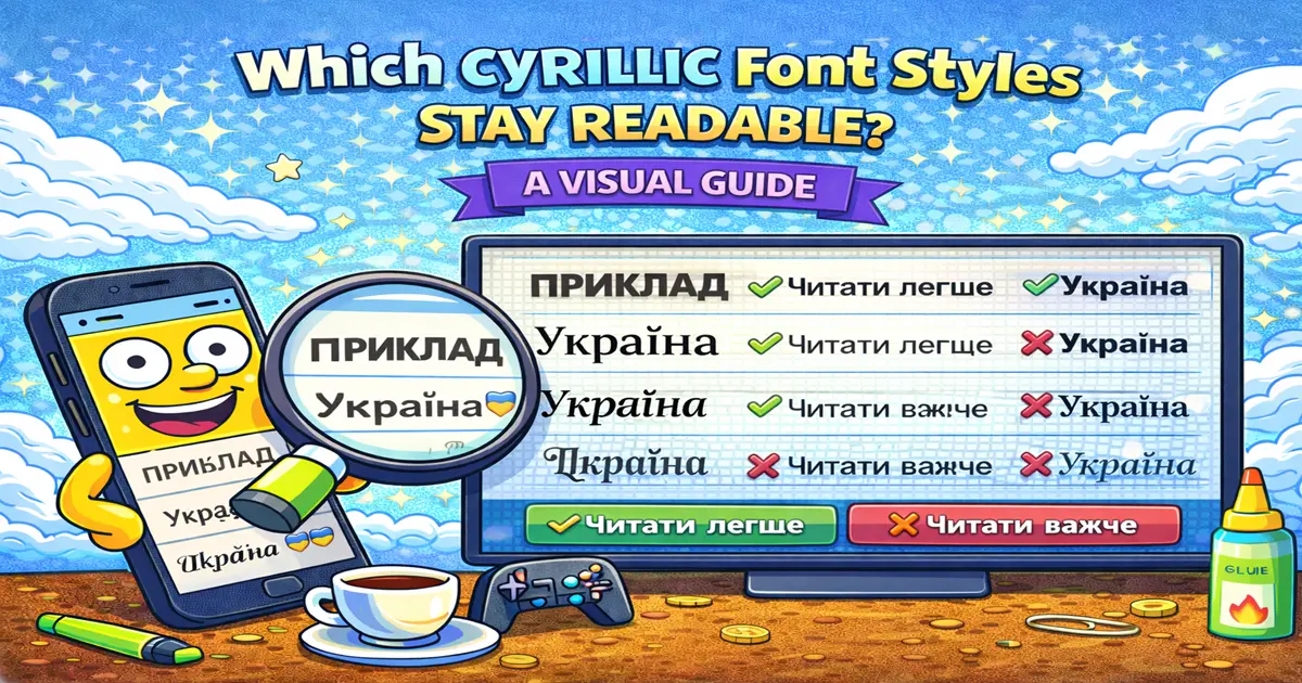
There is a big difference between text that looks decorative and text that people can actually read.
This matters even more with Cyrillic. Ukrainian, Russian, Bulgarian, Serbian, Macedonian, and other Cyrillic alphabets do not always have the same decorative Unicode options that Latin text has. A style that looks great for English can become mixed, broken, or confusing when applied to Cyrillic.
This guide ranks practical Cyrillic styling choices by readability, not by how loud they look.
Best: Plain Cyrillic With Clean Structure#
The safest Cyrillic style is still normal Cyrillic text with good structure.
український блог
київ · фото · натхнення
новий пост ↓
Why it works:
- Every letter stays correct.
- It is easy to read on mobile.
- It works in bios, captions, statuses, and profile summaries.
- Search, translation, and copy-paste behave normally.
Use this for anything important: names, contact details, instructions, profile descriptions, server rules, and brand text.
Very Good: Cyrillic Plus Symbols#
Symbols can make Cyrillic text feel styled without changing the letters.
✦ український щоденник ✦
♡ краса · стиль · натхнення
☾ нічні нотатки
Good symbols for Cyrillic profiles:
✦ ✧ ⋆ ★ ☆ ♡ • · | ↓ →
This is usually the best balance: readable words plus enough visual personality.
Use it for:
- Instagram bios
- TikTok bios
- Discord statuses
- Steam profile summaries
- Telegram channel descriptions
Very Good: Cyrillic Plus Emoji#
Emoji are often clearer than fake fancy letters.
📍 Київ
🎮 ігровий сервер
✨ нові ідеї щодня
☕ кава · робота · нотатки
Emoji work well because they label the topic quickly. They also avoid the biggest Cyrillic problem: they do not try to transform the alphabet.
Use emoji as labels, not as replacements for important words.
Good: Minimal Separators#
Separators are simple, but they make short Cyrillic lines easier to scan.
дизайн · шаблони · соцмережі
музика | стиль | щоденник
── новий пост ──
This is a strong option for professional or creator profiles. It feels polished without looking overdecorated.
Best separators:
· | / - ─ •
Avoid long divider lines in short bios. They can waste valuable space.
Good in Small Doses: Bilingual Styling#
If your brand naturally uses both Latin and Cyrillic, you can style the Latin part and keep Cyrillic readable.
𝙉𝙤𝙫𝙖 Studio | українські шаблони
Mood Lab · щоденник ідей
creator.tools · український контент
This works because the styled Latin text is a brand accent, while the Cyrillic text still carries the meaning.
Do not use Latin lookalikes to imitate Cyrillic. That can make the text wrong, harder to search, and harder to understand.
Risky: Glitch and Zalgo Cyrillic#
Glitch effects can look interesting, but they are risky with Cyrillic.
Problems:
- Marks can overlap letters.
- Line height can break on mobile.
- Some platforms render combining marks differently.
- Screen readers may read the marks awkwardly.
- The text becomes hard to scan quickly.
Use glitch only for tiny decorative effects, horror themes, or temporary joke text.
Do not use it for:
- Main profile names
- Contact details
- Server rules
- Important announcements
- Business profiles
Risky: Heavy Symbol Frames#
Frames can look nice, but too much decoration pushes the words into the background.
Too much:
✦⋆♡── український блог ──♡⋆✦
Cleaner:
✦ український блог
If the decoration is more noticeable than the words, simplify.
Usually Bad: Fake Cyrillic With Latin Lookalikes#
Some generators try to make Cyrillic look fancy by replacing letters with similar Latin characters.
This is risky because the text may stop being real Cyrillic.
Example problem:
- Cyrillic
аand Latinacan look similar but are different characters. - Cyrillic
сand Latinccan be confused. - Cyrillic
рand Latinpare not the same letter.
This can hurt readability, search, translation, copy-paste, and accessibility.
Avoid this for real names, brands, bios, and anything public.
Usually Bad: Script, Gothic, Double-Struck for Cyrillic#
Script, gothic, fraktur, double-struck, and monospace Unicode styles are mostly designed around Latin characters.
For Cyrillic, they often do one of these:
- Leave Cyrillic unchanged
- Transform only Latin parts
- Mix scripts awkwardly
- Replace letters with lookalikes
- Produce missing boxes or broken text
These styles can still be useful for English words inside a profile, but they should not be forced onto full Cyrillic sentences.
Readability Ranking#
Use this ranking when choosing a style.
| Rank | Style Approach | Readability | Best Use |
|---|---|---|---|
| 1 | Plain Cyrillic with structure | Excellent | Important text |
| 2 | Cyrillic plus symbols | Excellent | Bios and statuses |
| 3 | Cyrillic plus emoji | Excellent | Social profiles |
| 4 | Minimal separators | Very good | Professional profiles |
| 5 | Bilingual Latin accent | Good | Brand names and creator pages |
| 6 | Heavy frames | Mixed | Short aesthetic lines |
| 7 | Glitch or zalgo | Risky | Temporary decorative text |
| 8 | Fake Latin lookalikes | Bad | Avoid |
| 9 | Unsupported script/gothic/double-struck | Bad | Avoid for Cyrillic |
Platform Notes#
Instagram#
Keep Cyrillic bios compact. Symbols, emoji, and separators work well. Avoid heavy decoration because the bio space is small.
TikTok#
TikTok profiles are scanned quickly. Use one visual idea, such as emoji labels or a simple separator.
Discord#
For Discord nicknames, readability matters because people need to recognize and mention you. Use symbols around the name only if the name stays clear.
Steam#
Steam summaries allow more text, so dividers and sections can work well. Keep display names simpler than profile descriptions.
Telegram#
Telegram display names and channel descriptions can use symbols. Usernames are stricter, so do not rely on decorative Unicode there.
Mobile Checklist#
Before using styled Cyrillic:
- Check it on a phone.
- Make sure every word is readable at normal size.
- Remove symbols that crowd the line.
- Keep important details plain.
- Avoid mixed-script lookalikes.
- Test the exact platform where you will use it.
If the style only looks good when zoomed in, it is not a good profile style.
Practical Examples#
Clean Personal Bio#
♡ український щоденник
київ · фото · натхнення
новий пост ↓
Gaming Profile#
🎮 нічний сервер
clips · discord · steam
граємо після 21:00
Creator Profile#
✦ дизайн для соцмереж
шаблони · ідеї · візуал
зв'язок у DM
Minimal Channel Description#
новини | гіди | корисні посилання
Accessibility Notes#
Readable text is not only about eyesight. It also affects:
- Screen readers
- Translation tools
- Search
- Copy-paste
- Voice dictation
- People reading on small screens
The more you replace real letters with decorative alternatives, the more fragile the text becomes.
Use decoration around Cyrillic text, not instead of it.
FAQ#
What is the most readable Cyrillic style?#
Plain Cyrillic with clean structure is the most readable. Add symbols, emoji, or separators if you want visual style.
Can I make Ukrainian or Russian text gothic?#
Not reliably as copy-paste Unicode text. Gothic-style Unicode alphabets are mostly Latin-focused, so full Cyrillic text usually will not transform cleanly.
Are emoji safe with Cyrillic text?#
Yes, when used as labels or accents. Keep the actual words readable.
Should I use fake Latin lookalikes?#
No. They can make the text technically wrong and harder to search, translate, or read.
Can I test Cyrillic text before posting?#
Yes. Paste it into the Font4Social generator, then also test it on the platform where you plan to use it.
Final Advice#
For Cyrillic, the cleanest style is usually not the heaviest style. Keep the letters real, use small visual accents, and test on mobile.
If the words stay readable first, the design will age much better.