Your TikTok bio is prime real estate. It's the first thing people see when they click on your profile, and it's your chance to show personality, set expectations, or drive followers somewhere. But if your fancy font is breaking into boxes or looking like emoji soup, that first impression is ruined.
The good news? TikTok actually handles Unicode fonts pretty well. The trick is knowing which ones play nice with the platform and which ones will render like a glitched video game on your followers' phones.
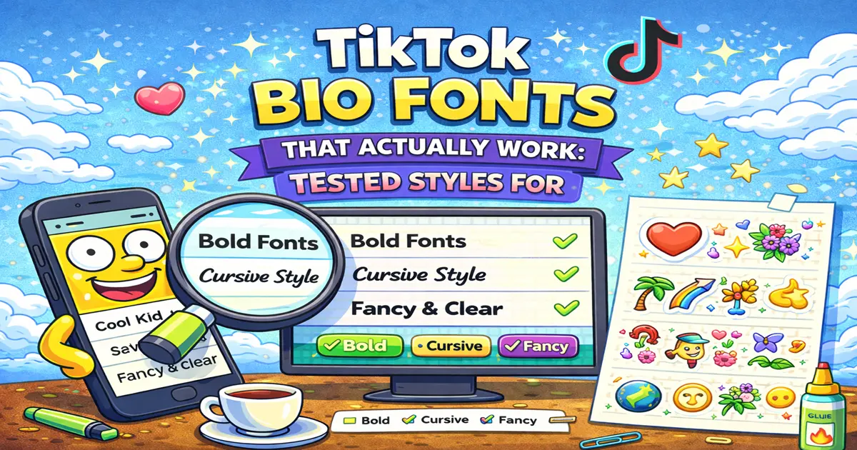
I've tested tons of fonts on both iOS and Android TikTok, and I'm sharing the winners here — the ones that look polished, don't break, and actually make your bio stand out.
Why TikTok Bios Are Different (And Harder to Style)
Before we jump into the fonts, let's talk about why TikTok is pickier than Instagram or Twitter.
TikTok's bio field is limited. You get 80 characters total, which sounds like more than it is when you're trying to say something meaningful. Compare that to Instagram's 150 characters, and you're already in tight quarters.
That character limit matters because fancy Unicode fonts sometimes use "double width" characters or have weird spacing. What looks fine in a longer bio might completely break the layout in TikTok's compact space.
There's also the issue of how TikTok renders text. Unlike Instagram, which has years of Unicode support locked down, TikTok's rendering engine is a bit more finicky. Some fonts that work fine on Instagram will randomly glitch on TikTok, especially on Android devices.
And then there's the username situation. Your TikTok @username can't use fancy fonts at all — it's strictly alphanumeric and underscores. But your display name? That's where you can get creative. We'll cover both in the strategies below.
Pro Tip: Your TikTok bio displays differently on iOS and Android. Always test on both before you publish.
TikTok Bio Fonts That Actually Work (Tested & Reliable)
Here are the fonts that have proven themselves across devices. All of these will display correctly in your 80-character bio without rendering issues.
1. Bold Serif
Example: 𝐖𝐞𝐥𝐜𝐨𝐦𝐞 𝐭𝐨 𝐦𝐲 𝐓𝐢𝐤𝐓𝐨𝐤
Best for: Creators who want authority, brand professionals, coaches
Compatibility: 99.5% across iOS and Android
This is the "take me seriously" font. It's bold enough to stand out but not so weird that people have to squint. Great if you're positioning yourself as an expert or authority in your niche. Looks especially good paired with a calm, organized bio layout.
2. Italic Serif
Example: 𝘞𝘦𝘭𝘤𝘰𝘮𝘦 𝘵𝘰 𝘮𝘺 𝘞𝘰𝘪𝘓𝘰𝘬
Best for: Creative creators, writers, artists, anyone wanting elegance
Compatibility: 99% iOS, 98% Android
The slanted look gives you sophistication without being formal. If your content is creative—whether that's sketches, writing, poetry, or storytelling—this font adds that layer of intentionality. It suggests curated content.
3. Bold Sans-Serif
Example: 𝗧𝗶𝗸𝗧𝗼𝗸 𝗪𝗶𝘁𝗵 𝗚𝗥𝗟𝗩𝗘𝗦
Best for: Gaming, fitness, lifestyle, modern brands
Compatibility: 99% across all devices
This is the modern workhorse. No serifs, thick weight, instantly readable. If you're a gamer, fitness creator, or running a contemporary brand, this font says you're with it. It's clean, it's bold, it works.
4. Small Caps
Example: ꜱᴍᴀʟʟ ᴄᴀᴘꜱ ᴀʀᴇ ᴜɴᴅᴇɴɴᴀᴀʙʟᴇ
Best for: Everyone. Seriously. The most versatile option.
Compatibility: 99.5% across iOS and Android
Small caps are the sleeper hit of Unicode fonts. They look professional, sophisticated, and deeply readable. They work in literally any context—whether you're a beauty creator, educator, comedy account, or gaming streamer. This is the font that makes you look intentional without being loud about it.
5. Double-Struck / Outline
Example: 𝕯𝖎𝖈𝖖𝖚𝖎 𝖋𝖔𝖓𝖙
Best for: Tech creators, academics, anyone wanting something unique
Compatibility: 96% iOS, 94% Android (slightly lower on older devices)
The hollow, outlined look is distinctive. It reads as modern and a bit mysterious. Not everyone uses this one, so it definitely stands out. Fair warning: older Android devices might render this less cleanly, but newer ones handle it fine.
6. Monospace
Example: 𝚃𝚒𝚔𝚃𝚘𝚔 𝚊𝚎𝚜𝚝𝚑𝚎𝚝𝚒𝚌
Best for: Programmers, tech creators, retro/y2k vibes
Compatibility: 98% across devices
That typewriter computer vibe? This nails it. The monospace font gives everything a techy, intentional feel. Perfect if you're a developer, cybersecurity educator, or running a nostalgic retro aesthetic.
7. Italic Sans-Serif
Example: 𝘊𝘰𝘻𝘺 𝘢𝘯𝘥 𝘦𝘭𝘦𝘨𝘢𝘯𝘵
Best for: Wellness, beauty, lifestyle creators
Compatibility: 99% across all devices
Slanted without being formal. Modern without being harsh. This hits a sweet spot for creators building warm, approachable brands. It's got personality but doesn't scream.
Fonts That DON'T Work Well on TikTok (And Why)
Not every fancy font is worth your time. Here's what to avoid:
Zalgo Text — Stacked, chaotic-looking text. Looks cool in a generator preview, completely breaks on mobile. Your followers will see a jumbled mess. Skip it.
Gothic/Fraktur — While these look amazing, they're ornate and sometimes hard to read in a tiny 80-character bio. Save these for your display name instead of your bio.
Bubbles (Circled Text) — These work fine technically, but in a short bio they can look juvenile and take up too much visual space. Better for comments than bios.
Superscript/Subscript — These tiny styles don't scale well on mobile. They become barely readable and waste your precious characters.
Heavy Symbols or Decorative Borders — If your bio is mostly symbols and fewer actual words, TikTok's algorithm might have a harder time understanding your niche. More on this later.
Extreme Scripts — Ornate, hard-to-read scripts might look fancy, but usability beats aesthetics. Your bio should communicate who you are at a glance.
Real Talk: If you have to squint to read it in your preview, so will your followers. A gimmicky bio that people can't understand isn't building your brand—it's confusing it.
Step-by-Step: How to Change Your TikTok Bio Font
Alright, so you've picked a font. Here's how to actually get it into your TikTok bio:
Using Font4Social:
- Head to Font4Social's generator
- Type your bio text (keep it under 80 characters)
- Select your preferred font style from the list
- Copy the styled text
- Open TikTok and go to your profile
- Tap the "Edit Profile" button
- Click in the "Bio" field
- Clear the existing text and paste your new fancy text
- Tap "Save"
That's it. The font stays there. You can change it anytime by repeating these steps.
Important: TikTok's search algorithm still reads the underlying Unicode characters. Using a fancy font doesn't hide what you're saying or make TikTok less likely to show your profile. So don't worry about keyword placement—your bio is still fully searchable.
TikTok Bio Ideas by Creator Type
Different creator types benefit from different font choices. Here's how to match fonts to your content:
Comedy Creators
Font choice: Bold Sans-Serif or Italic Serif
Bio example: 𝗠𝗸𝗰𝗸𝗶𝗻𝗴 𝗮𝘀𝘆𝗻𝗰𝗿𝗮𝘀𝗺𝗲 & 𝗶𝗺𝗲𝗺𝗠
Comedy is about personality. You want a font that's bold and confident, not overly decorated. The audience should focus on your jokes, not get distracted by decorative fonts.
Dance / Choreography
Font choice: Bold Serif or Small Caps
Bio example: 𝐆𝐡𝐨𝐫𝐞𝐨𝐠𝐫𝐚𝐩𝐡𝐞𝐫 | 𝐓𝐢𝐤𝐓𝐨𝐤 𝐕𝐞𝐯 𝐌𝐞𝐦𝐞𝐞𝐱
Dance content is visual. You want your bio text to be clean and professional, emphasizing that your content is choreographed and intentional. Avoid anything too cute—let your dancing speak.
Education / How-To Creators
Font choice: Bold Sans-Serif or Small Caps
Bio example: ꜱᴛᴇᴍ ᴛᴏᴘɪᴄꜱ ᴇxᴘʟᴀᴄɴᴇᴅ ᴘʟᴀɪɴ ᴇᴍᴘʟɪꜱɦ
Educational content needs clarity and credibility. Choose fonts that scream "I'm organized and know my stuff." Skip anything too playful.
Gaming / Streaming
Font choice: Monospace or Bold Sans-Serif
Bio example: 𝚅𝙰𝚿𝙰𝚰𝙿𝚂 𝙰𝙽𝙴 | 𝚃𝚒𝚖𝚎𝚍 𝚄𝚃𝚎𝚘
Gamers recognize the vibe of a monospace font instantly. It reads as technical and cool. If you're streaming, this tells people you're serious about your content.
Beauty / Wellness / Aesthetic
Font choice: Italic Serif or Italic Sans-Serif
Bio example: 𝘴𝘦𝘭𝘧 𝘤𝘢𝘳𝘦 & 𝘨𝘳𝘰𝘸𝘵𝘩
Beauty and wellness audiences appreciate elegance. An italic font communicates that your account is thoughtfully curated. Keep it calming and intentional.
Business / Entrepreneur
Font choice: Bold Serif or Small Caps
Bio example: ꜱʜᴀʀᴇ ᴍᴀʀᴋᴇᴛɪɴɢ ꜱᴛʀᴀᴛᴇɢɪᴇꜱ | ʟɪɴᴋ ↓
Business-focused accounts need to look professional and trustworthy. Fancy fonts work here because they show intentionality, but they can't be so weird that they undermine your credibility.
How Bio Fonts Affect Discovery (Real Impact)
Here's a question I get a lot: does using a fancy font help or hurt TikTok discovery?
Short answer: Neither. Not directly.
TikTok's algorithm reads the underlying Unicode characters regardless of how they're styled. If your bio says "cooking tips," TikTok understands that whether you're using Bold Serif, Small Caps, or plain text.
But here's where font choices matter:
A well-chosen font that matches your brand makes your profile look more intentional and polished. When someone lands on your profile, that polish builds trust. Trust leads to follows. Follows lead to more watch time, and watch time is what TikTok actually cares about.
A distracting or hard-to-read font, on the other hand, can actually hurt discovery because it makes your profile less appealing at a glance. If someone takes one look and thinks "this looks like spam," they're leaving.
So the real impact is indirect: better fonts = better first impressions = more follows = better discovery long-term.
Strategy Note: Your font choice is part of your overall brand presentation. When your bio font matches your content aesthetic, the whole package feels coherent and intentional.
Bonus: Pair Your Bio Font with Your Display Name
Remember how we said your @username can't have fancy fonts? But your display name can?
Use your display name and bio together strategically:
Display Name: Your actual name or brand name (can include Unicode fonts)
Bio: Your value proposition or description
Example:
- Display Name: 𝐅𝐢𝐭𝐧𝐞𝐬𝐬 𝐉𝐨𝐧
- Bio: 🏋️ HIIT & Strength | Link Below
This combo gives you visual impact (fancy display name) plus clarity (readable bio). Best of both worlds.
Learn more about stylish display names in our guide on TikTok Username Font Ideas, where we dive into fonts specifically designed for display names.
The Final Word
Your TikTok bio is small real estate, so every character matters. Choose a font that's readable, fits your brand, and actually renders correctly on both iOS and Android. Test it on your phone before going live, and swap it out anytime the mood strikes.
The fonts above? They all work. Pick the one that makes you feel like your best self, and let your content do the heavy lifting.
Want to generate your exact bio text in any of these fonts without the copy-paste hassle? Use Font4Social to see your bio styled in real-time, then copy and paste straight to TikTok.
And if you're looking for even more creative text ideas—symbols, emoji combos, layout hacks—check out our ultimate guide on Stylish Text for TikTok: Copy & Paste Fonts, Symbols, and Emojis.
Your TikTok bio should scream "you." These fonts make sure it does.