There's a tension at the heart of Instagram bio design: you want to stand out, but you also need people to actually read what you're saying.
I've watched countless creators choose fonts so decorative and unusual that their followers can't figure out what their bio says. They get fewer clicks, fewer follows, and honestly, probably fewer business inquiries — all because the fancy font looked cool in the preview.
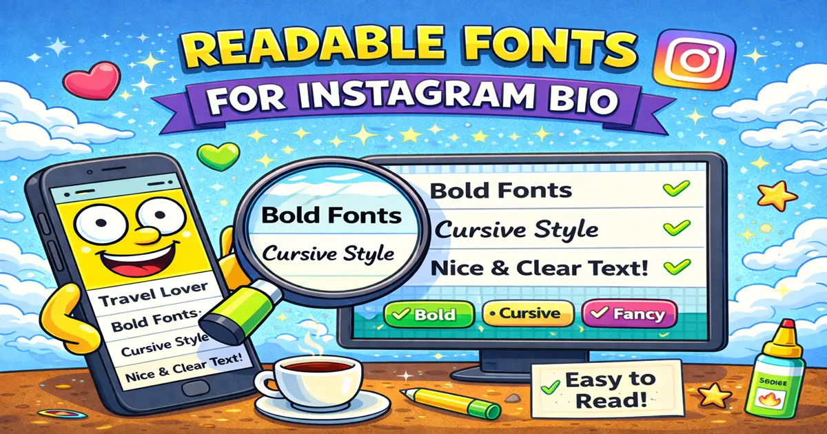
Let's fix that. This guide covers fonts that are genuinely readable while still being distinctive. Fonts that work at small sizes on phone screens. Fonts that don't make people strain to decipher your actual message.
The Problem: Readable vs. Decorative
First, let's understand what makes a font readable or unreadable.
Readability factors:
- Letter spacing: Characters that are too close together or too far apart are hard to read. You need that Goldilocks zone.
- X-height: The height of lowercase letters like 'x' and 'a'. Higher x-height = easier to read at small sizes.
- Stroke contrast: Thick and thin strokes. Too much variation confuses the eye. Too little feels boring.
- Counter space: The space inside letters. If it's too small (think very condensed fonts), text becomes a blur.
- Overall weight: Super light fonts disappear on screens. Super heavy fonts feel aggressive.
Most fancy Unicode fonts prioritize looking interesting over these readability factors. They sacrifice clarity for novelty.
The fonts I'm recommending here strike a balance. They look noticeably different from regular text while remaining scannable and readable.
The 7 Most Readable Fancy Fonts for Instagram Bio
1. Small Caps
Example: ꜱᴍᴀʟʟ ᴄᴀᴘꜱ ᴅɪɢɪᴛᴀʟ ᴄʀᴇᴀᴛᴏʀ
Readability score: 10/10
Why it works: Small caps are essentially uppercase letters at the height of lowercase letters. Your brain reads it instantly because it uses the same letter shapes you've been reading your entire life. The only change is the size, which adds visual interest without creating confusion.
Best use: Your entire bio. This is the safest choice for any bio that contains actual important information.
Visual weight: Elegant without being heavy
2. Bold Sans-Serif
Example: 𝗗𝗶𝗴𝗶𝘁𝗮𝗹 𝗖𝗿𝗲𝗮𝘁𝗼𝗿 𝗔𝗻𝗱 𝗦𝗢𝗰𝗶𝗮𝗹 𝗚𝗿𝗼𝗪𝗜𝗡𝗚
Readability score: 10/10
Why it works: No serifs means clean lines. The bold weight makes it pop from your screen without being hard to decode. It's modern, professional, and distinctly different from regular text.
Best use: Your entire bio, or just the first line (your title/role)
Visual weight: Strong and confident
3. Italic Sans-Serif
Example: 𝘋𝘪𝘨𝘪𝘵𝘢𝘭 𝘊𝘳𝘦𝘢𝘵𝘰𝘳 𝘈𝘯𝘥 𝘍𝘰𝘶𝘯𝘥𝘦𝘳
Readability score: 9/10
Why it works: Slanted text (italics) is still perfectly readable. Your brain compensates for the angle instantly. It feels contemporary and slightly playful while maintaining full legibility.
Best use: The main section of your bio. Works especially well for creative professionals.
Visual weight: Modern and approachable
4. Bold Serif
Example: 𝐃𝐢𝐠𝐢𝐭𝐚𝐥 𝐂𝐫𝐞𝐚𝐭𝐨𝐫 𝐀𝐧𝐝 𝐀𝐮𝐭𝐡𝐨𝐫
Readability score: 9/10
Why it works: Serifs actually help some people read better — the little feet guide your eye along the line. The bold weight ensures it's visible even on smaller screens. This reads as established and professional.
Best use: Name/title line for maximum authority, or full bio if you want a premium feel
Visual weight: Authoritative and established
5. Monospace (Regular Weight)
Example: 𝙳𝚒𝚐𝚒𝚝𝚊𝚕 𝙲𝚛𝚎𝚊𝚝𝚘𝚛 𝚊𝚗𝚍 𝚃𝚎𝚌𝚑 𝙻𝚎𝚊𝚍
Readability score: 9/10
Why it works: Every character takes exactly the same width, which creates a rhythm your eye finds easy to follow. It feels intentional and technical, but never confusing.
Best use: Full bio, especially for tech creators, programmers, and minimalist brands
Visual weight: Clean and intentional
6. Italic Serif
Example: 𝘋𝘪𝘨𝘪𝘵𝘢𝘭 𝘚𝘧𝘡𝘦𝘨𝘧 𝘈𝘯𝘥 𝘎𝘩𝘖𝘱𝘧𝘥𝘥𝘦𝘱
Readability score: 8.5/10
Why it works: Combining serifs with italics feels elegant without being overly decorative. It reads beautifully on screens and conveys sophistication.
Best use: Bio text and descriptions (especially for writers, artists, and luxury brands)
Visual weight: Elegant and refined
7. Bold and Italic Combination
Example: 𝒃𝒐𝒍𝒅 𝒂𝒏𝒅 𝒊𝒕𝒂𝒍𝒊𝒄 𝒄𝒐𝒎𝒊𝒏𝒆𝒅 𝒇𝒐𝒓 𝒊𝒎𝒑𝒂𝒄𝒕
Readability score: 8/10
Why it works: You're combining two changes (slant + weight), which creates visual interest. But since neither change alone makes text hard to read, the combination stays readable.
Best use: Highlights or key phrases within your bio. Use it sparingly.
Visual weight: Bold and distinctive
The Readability Comparison Table
| Font | Readability | Looks Distinct | Best For | Risk Level |
|---|---|---|---|---|
| Small Caps | 10/10 | 9/10 | Anything | Very Low |
| Bold Sans | 10/10 | 9/10 | Professional or creative | Very Low |
| Italic Sans | 9/10 | 8/10 | Modern brands | Low |
| Bold Serif | 9/10 | 9/10 | Premium/authority | Low |
| Monospace | 9/10 | 8/10 | Tech/minimal | Low |
| Italic Serif | 8.5/10 | 9/10 | Luxury/creative | Low |
| Bold + Italic | 8/10 | 10/10 | Highlights only | Medium |
What to avoid: Gothic, Zalgo, rare script blocks, super light weights, and anything that requires people to actually think about what they're reading.
The Science of Small-Screen Readability
Your Instagram bio appears in three main contexts:
-
The preview before someone follows you — Super small text. Maybe 12 pixels. Hard to read decorative fonts completely fall apart here.
-
Your actual bio page — Larger, but on a mobile phone screen. Still constrained space.
-
Your bio when someone visits from a desktop — Finally some breathing room, but still smaller than regular article text.
The fonts on my recommended list work across all three contexts because:
- They have clear character distinction (you can tell 'i' from 'l', '0' from 'O')
- They maintain consistent weight (no weird thick and thin spots)
- They use common Unicode ranges supported by all devices
- They scale gracefully down to small sizes
Decorative fonts often fail in context #1 and #2 because they rely on novelty and detail that disappears at small sizes.
Font Pairing Strategy: Maximum Impact
Want the best of both worlds? Use a decorative font for your name and a readable font for your actual bio.
Example 1:
Name: 𝔊𝔬𝔱𝔥𝔦𝔠 𝔇𝔦𝔭𝔦𝔦𝔩𝔱𝔩 𝔄𝔪𝔞𝔳𝔞𝔯 (Gothic/Fraktur) Bio: Small caps bio with actual information
Example 2:
Name: 𝒃𝒐𝒍𝒅 𝒃𝒆𝒂𝒄𝒖𝒕𝒍𝒆 𝒔𝒄𝒓𝒊𝒑𝒕 Bio: Bold sans-serif for clarity and readability
This way:
- Your name stands out and catches attention
- Your bio remains readable so people actually know what you do
- The contrast between decorative and clear creates visual hierarchy
Pro Tip: Always use a readable font for any bio text that contains important information like a job title, location, or call to action. Save the fancy fonts for your display name.
Testing Readability on Mobile
Don't just preview your bio in a browser. Test it on your actual phone:
- Change your bio
- Close and reopen the Instagram app
- Look at your profile
- Step back from your phone and see if you can still read it from arm's length
If you're squinting, your followers are squinting. Change it.
Accessibility and Your Audience
Here's something important that often gets overlooked: decorative fonts can be genuinely difficult for people with visual processing differences to read.
People with dyslexia, astigmatism, or even just aging eyes may skip accounts with hard-to-read bios. Using a readable font isn't just better design — it's more inclusive.
The fonts I recommended in this guide are readable for:
- Visually impaired users with screen readers
- People with dyslexia
- Older audiences
- Non-native English speakers
- Basically everyone
There's no downside to choosing readability. You still look distinctive and intentional.
The Middle Ground: Decorative But Still Readable
If Small Caps feels too "normal" for your brand, these fonts are decorative enough to turn heads but readable enough for real use:
- Circled/Bubbles: Ⓑⓤⓑⓑⓛⓔ Ⓕⓞⓣ - Playful but legible
- Outline: 𝕻𝖙𝖙𝖓𝖎𝖒𝖊 - Distinctive without being hard to read
- Italic Serif: 𝘧𝘦𝘦𝘭𝘴 𝘱𝘳𝘦𝘮𝘪𝘶𝘮 𝘣𝘶𝘵 𝘪𝘴 𝘳𝘦𝘢𝘥𝘦𝘳-𝘧𝘳𝘪𝘦𝘯𝘥𝘭𝘺
These hit the sweet spot between "interesting" and "please don't make me decode your bio."
From Theory to Practice
Here's the real talk: the fanciest font in the world doesn't matter if nobody can read it.
A readable, distinctive font like Bold Sans-Serif or Small Caps will get you more engagement than an elaborate Gothic font that requires decoding. People will understand your bio, click your link, and actually follow you.
The best font is the one that reflects your brand and that people can actually read.
Want to experiment? Check out Font4Social to generate your bio in different readable fonts instantly. See which one feels right, test it on your phone, and go from there.
For more font options and guidance on choosing fonts that work across devices, explore our complete guide to the best Instagram bio fonts. And if you want to level up your bio design beyond fonts, check out our collection of Instagram bio symbols and layout ideas.
Your bio is your first impression. Make it count — and make it readable.