If you've ever copied a "cool font" into your Instagram bio only to have it look like complete gibberish on your phone, you're not alone. The problem is that not all Unicode fonts render the same way across devices, and Instagram's text rendering can be finicky.
I've tested dozens of fancy fonts over the past few years, and I'm here to share the 15 that actually work — the ones that look great on iOS, Android, desktop, and even show up correctly when people view your profile from different browsers.
Why Some Unicode Fonts Break on Instagram (And Why Others Don't)
Before we dive into the list, let's talk about what makes a font work or break on Instagram. Instagram doesn't use custom font files — it uses Unicode characters. Basically, you're not changing fonts at all; you're replacing regular letters with special Unicode characters that look like different fonts.
Here's the catch: not all devices have all Unicode characters installed. When a character isn't available, the system shows a box or reverts to default text. Some fonts use rare Unicode ranges that older phones or specific devices don't support.
The fonts that "actually work" are ones that use widely-supported Unicode blocks. We're talking about mathematical alphanumeric symbols, which have been around for years and are available on pretty much every modern device.
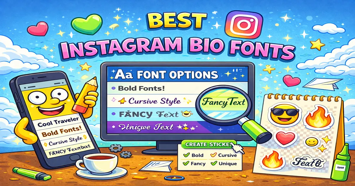
The 15 Best Instagram Bio Fonts (Tested & Ready to Copy)
1. Bold Serif
Example: 𝐁𝐨𝐥𝐝 𝐒𝐞𝐫𝐢𝐟 𝐃𝐢𝐠𝐢𝐭𝐚𝐥 𝐂𝐫𝐞𝐚𝐭𝐨𝐫
Best for: Professional bios, premium brands, people who want to look established
Compatibility: 99% across all devices
This is the go-to if you want to look professional but still stand out. The bold weight makes it really pop without looking too decorative. Works beautifully for coaches, consultants, and anyone in business.
2. Italic Serif
Example: 𝘋𝘦𝘷𝘦𝘭𝘰𝘱𝘦𝘳 𝘋𝘢𝘳𝘦𝘥𝘦𝘷𝘪𝘭
Best for: Creative fields, writers, artists who want an elegant touch
Compatibility: 99% across all devices
Slanted but still professional. This pairs beautifully with a plain name field if you're going for understated elegance.
3. Monospace
Example: 𝙳𝚒𝚐𝚒𝚝𝚊𝚕 𝙲𝚖𝚟𝚣𝚎𝚛
Best for: Coders, tech creators, minimalist aesthetic
Compatibility: 98% across all devices
That typewriter vibe? Yeah, this nails it. Perfect if you're in tech or want a retro-modern look. The spacing is consistent and visually distinctive.
4. Gothic/Blackletter
Example: 𝔊𝔬𝔱𝔥𝔦𝔠 𝔇𝔦𝔤𝔦𝔱𝔞𝔩 𝔞𝔠𝔠𝔦𝔞𝔠𝔯𝔦𝔬𝔯
Best for: Musicians, artists, alternative brands
Compatibility: 95% (some older Android devices may have issues)
This one turns heads. It's ornate without being unreadable. Use it sparingly — maybe just for your name, not your whole bio.
5. Outline/Hollow
Example: 𝕺𝖚𝖞𝖑𝖎𝖓𝖆 𝕱𝖔𝖓𝖙 𝖎𝖘 𝖋𝖆𝖓𝖈𝖎𝖠𝖎𝖘
Best for: Creative professionals, designers, anyone wanting uniqueness
Compatibility: 95%
The hollow look is distinctive and elegant. It has this minimalist vibe that reads as modern and intentional.
6. Bubbles/Circled
Example: Ⓑⓤⓑⓑⓛⓔ Ⓕⓞⓝⓣ Ⓑⓔⓣⓣⓔⓡ
Best for: Fun, casual, youth-oriented accounts (TikTok creators, gaming, lifestyle)
Compatibility: 98%
It's playful. It's fun. Yes, it's a little loud, but if that matches your vibe, lean into it. Great for people building a casual, approachable brand.
7. Small Caps
Example: ꜱᴍᴀʟʟ ᴄᴀᴘꜱ ɴᴇᴠᴇʀ ɢᴏ ᴏᴜᴛ ᴏꜰ ꜱᴛʏʟɛ
Best for: Everyone. Seriously. One of the most versatile options.
Compatibility: 99%
Small caps look sophisticated, are highly readable, and work in almost any context. This should be on your shortlist regardless of your niche.
8. Double-Struck/Blackboard
Example: 𝔻𝕠𝕦𝕓𝕝𝕖-𝕾𝖘𝖎𝖙𝖚𝖚𝖐 𝖈𝖆𝖓 𝕺𝖆𝖎𝖙 𝖆𝖙𝖚𝖯𝖎𝖋𝖐 𝖏
Best for: Math-oriented accounts, serious professionals, scholarly vibes
Compatibility: 96%
The double-struck look has a distinctive formal quality. Good for academics, researchers, or anyone wanting a sharp, defined aesthetic.
9. Italic Sans-Serif
Example: 𝘚𝘭𝘺𝘯𝘵𝘦𝘥 𝘮𝘦𝘢𝘯𝘴 𝘢𝘮𝘢𝘻𝘪𝘯𝘨 𝘧𝘰𝘯𝘵𝘴
Best for: Modern brands, fitness creators, lifestyle influencers
Compatibility: 99%
This is sleek and contemporary. It has edge without being weird. Perfect middle ground between boring and too-cute.
10. Script/Cursive
Example: 𝓐𝓷𝓭 𝓽𝓱𝓮𝓷 𝓽𝓱𝓮𝓻𝓮'𝓼 𝔠𝔦𝔯𝔠𝔩𝔦𝔡𝔬𝔠𝔲𝔞𝔯𝔞
Best for: Fashion, beauty, wellness creators
Compatibility: 98%
Flowing and elegant. Use this if you want to convey luxury or sophistication. Just keep it short — long paragraphs in cursive get hard to read.
11. Fraktur
Example: 𝔉𝔞𝔞𝔨𝔱𝔲𝔯 𝔐𝔲𝔯𝔡𝔦𝔭𝔦𝔴𝔯
Best for: Gothic aesthetic, fantasy content, alternative creative communities
Compatibility: 94% (requires more recent devices)
Similar to Gothic but slightly different character forms. Medieval and dramatic. Use it if that's your brand.
12. Sans-Serif Bold
Example: 𝗕𝗼𝗹𝗱 𝘀𝗮𝗻𝘀-𝘀𝗲𝗿𝗶𝗳 𝗶𝘀 𝗹𝗶𝗸𝗲 𝘁𝗼𝗿𝗺𝗲𝗺
Best for: Corporate accounts, fitness, productivity brands
Compatibility: 99%
No serif, thick weight, super readable. This is the classic "stands out but remains professional" choice.
13. Mixed Case Serif
Example: 𝐌𝐢𝐱𝐞𝐝 𝐠𝐜𝐢𝐟𝐞𝐬 𝐚𝐫𝐞 𝐞𝐥𝐞𝐠𝐚𝐧𝐭
Best for: Luxury brands, high-end creative work
Compatibility: 98%
Formal and distinct. Great if you want people to know you take yourself seriously.
14. Superscript Style
Example: ᵖᵘᵘ Superscript tiny text works
Best for: Niche creative use, paired with regular text for visual hierarchy
Compatibility: 95%
This is more of a tool than a primary font choice. Use it strategically for subtitles or secondary info, not your main bio.
15. Mixed Italic and Bold
Example: 𝒃𝒐𝒍𝒅 𝒂𝒏𝒅 𝒊𝒕𝒂𝒍𝒊𝒄 𝒄𝒐𝒎𝒃𝒐 𝒗𝒊𝒃𝒆𝒔
Best for: Creative professionals who want maximum flair without going full cursive
Compatibility: 98%
The best of both worlds. Bold enough to be noticed, italic enough to be interesting. Honestly, this should be higher on most people's lists.
Fonts You Should Avoid (Common Mistakes)
Not all fancy text is created equal. Here's what to skip:
Zalgo Text — This creates stacked characters that look cool in a desktop preview but completely break on mobile. Avoid at all costs.
Super Rare Unicode Blocks — Some fonts use old Sumerian or rarely-supported scripts. They might look cool in your generator, but you're gambling that your followers' devices support them.
Z-Width Characters — These create invisible spacing issues that can throw off your bio formatting.
Over-Modified Scripts — If you can barely read it, so can your followers. A confusing bio isn't a cool bio.
Pro Tips for Font Pairing
Want to level up your bio game? Use multiple fonts strategically:
- Name field: Go decorative. Use Gothic, Cursive, or Bubbles. This is your moment to shine.
- Bio text: Keep it readable. Stick with Small Caps, Bold Sans-Serif, or Italic Serif.
- Link section: Plain text is fine here. Readability beats aesthetics when people are trying to click.
Pro Tip: Test your chosen fonts on your actual phone before posting. What looks great in a preview can render differently depending on your device and Instagram's app version.
Generate Your Own Fonts Instantly
Don't want to copy-paste Unicode? Use Font4Social to generate your exact bio text in any of these fonts. Just type your bio, select your font, copy, and paste directly to Instagram. No Unicode copying games required.
Putting It All Together
The reality is that the "best" font is the one that matches your brand and actually displays correctly on your audience's devices. These 15 options all hit that sweet spot.
Start with one of the compatibility champions (Small Caps, Bold Sans-Serif, or Bold Serif), test it on your phone, and swap it out if it doesn't feel right. You can always refresh your bio in a few weeks with something new.
Want more ideas? Check out our guide on how to change your Instagram bio font for step-by-step instructions, or explore creative symbol ideas to pair with any of these fonts.
Your Instagram bio should feel like you. These fonts just make sure that version of you comes through loud and clear.